Look Up, Look Out: How Smart Room Design Is Quietly Saving Us from Screen Burnout
Somewhere around hour four of back-to-back video calls, something in your brain starts to check out. Your eyes glaze. Your shoulders creep toward your ears. You find yourself staring at your own face in the corner of the screen, wondering when exactly that became a normal thing humans do for six hours a day.
We've spent a lot of time talking about productivity hacks, standing desks, and blue-light glasses. But a growing number of architects and interior designers across the US are asking a different question entirely: what if the room itself is the problem — and the solution?
The Screen Isn't the Whole Story
Zoom fatigue is real, and the research backs it up. But here's what's interesting — the exhaustion isn't purely about the screen. It's about the visual environment surrounding the screen. When your eyes have nowhere to go but a flat, glowing rectangle, your brain is essentially trapped. There's no depth to read, no horizon to rest on, no peripheral movement to process. You're staring into a visual dead end, over and over, for hours.
Designers are starting to treat this as a spatial problem with a spatial solution. The idea is straightforward: give the eyes somewhere else to go. Not a distraction — a release valve.
"We're wired to scan," says one Los Angeles-based architect who has been redesigning home offices for remote workers since 2021. "Our visual system expects depth, layering, distance. When you flatten all of that into a screen, you're fighting your own biology."
Sightlines as Strategy
One of the most talked-about moves in thoughtful home office design right now is the deliberate sightline — a visual path that guides your gaze away from the monitor and toward something meaningful in the room or beyond it.
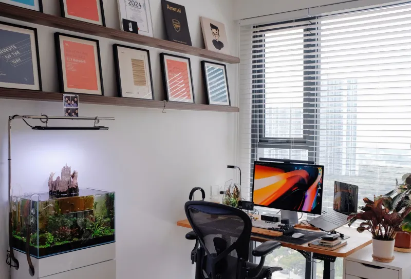
This isn't accidental. It's engineered. Designers are positioning desks so that a natural glance to the left or right lands on a window, a layered bookshelf, a plant arrangement with varying heights, or even a carefully placed piece of art at a specific distance. The goal is depth — the sense that space continues past the immediate foreground.
In denser urban environments like New York or Chicago, where a window might look straight into another building, designers are getting creative. Interior depth becomes the priority. A workspace might be set up so that behind the monitor, across the room, there's a visually rich but calm vignette — stacked objects at different distances, soft texture variation, a lamp casting warm light at a mid-ground level. Your eyes get to travel, even if it's just across fifteen feet.
The Window Question
For years, conventional workspace wisdom said to put your monitor in front of a window to avoid glare. Designers are now pushing back on that. A window behind your screen means the brightest thing in your visual field is still the screen. The light outside is competing with the light in front of you, and losing.
The emerging preference is a window to the side — ideally at a comfortable 45-degree angle from the primary work position. That way, a single glance away from the screen gives you actual sky, actual movement, actual distance. Even a few seconds of that, repeated throughout the day, appears to make a measurable difference in how people feel by the end of a long call-heavy afternoon.
In suburban and rural areas, this is easier to pull off. Designers working with clients in places like the Pacific Northwest or the mountain west are going further — positioning desks so that tree canopy or open landscape fills the peripheral view almost constantly. The screen becomes a temporary focus, not the permanent one.
Layering the Room
Beyond windows and sightlines, there's a broader principle gaining traction in design circles: spatial layering. The idea is that a room should have visual interest at multiple depths — something close, something mid-range, something far. This is actually a principle borrowed from landscape design and theatrical set design, and it turns out to work beautifully in home offices.
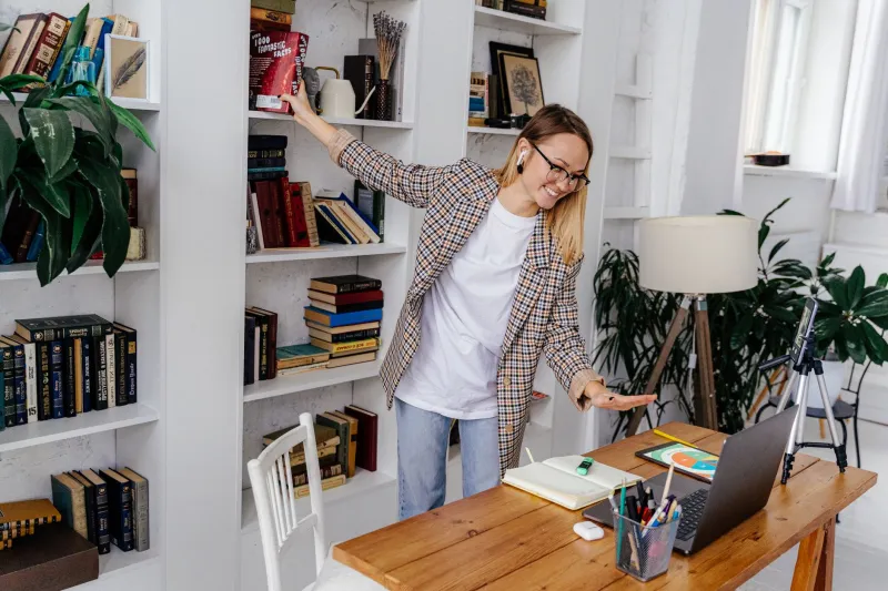
In practice, this might look like: a textured surface on the desk itself (close), a shelving unit with books and objects at varying heights (mid-range), and an open doorway or window view beyond (far). When your eyes move between these layers, they're doing something closer to what they evolved to do — reading a three-dimensional environment, not a two-dimensional feed.
Designers in cities like Austin and Denver are incorporating this into their residential projects almost as a standard consideration now. It's not a luxury add-on. It's being treated as basic ergonomics, just for your visual system instead of your spine.
Plants Are Doing More Work Than You Think
It's worth saying something specific about plants, because they keep coming up in these conversations. Not because they're trendy — though they obviously are — but because they're doing something specific and functional in this context.
Leaves move. Not dramatically, but they shift slightly with air currents, with light changes throughout the day. That subtle, low-level movement in your peripheral vision is apparently something our brains find genuinely calming. It's the opposite of a static wall. It's a tiny, continuous signal that the world is alive and three-dimensional.
Several designers mentioned placing plants specifically at the edge of the desk sightline — not in front of the monitor, but just to the side, close enough to catch peripheral attention without demanding direct focus. It sounds almost too simple, but the people doing it report that it helps.
Designing for the Pause
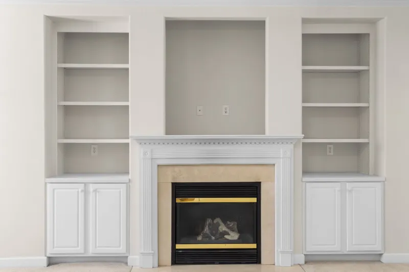
Maybe the most interesting shift in how designers are approaching this is the idea of designing for the pause — the moment between calls, the breath between tasks. Rather than filling every inch of the workspace with function, some designers are deliberately leaving visual rest points. A blank stretch of wall. An empty corner with only a single object. A window with nothing in front of it.
The room, in this thinking, isn't just a backdrop for productivity. It's a participant in your mental state. A well-designed workspace doesn't just hold your work — it gives you somewhere to recover from it.
That's a genuinely different way of thinking about the spaces most of us spend the majority of our waking hours in. And it suggests that the next frontier in home design isn't about adding more — it's about being a lot more intentional about what's already there, and where it sits in relation to your tired, screen-saturated eyes.
Your room has been trying to help you this whole time. You just haven't been designing it to let it.