Show Your Stuff: Why the Best Designers Are Done Pretending They Own Nothing
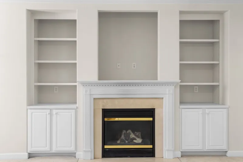
For the better part of two decades, the design world handed us a very specific fantasy. Clean counters. Empty shelves. A single ceramic bowl on a vast wooden table, lit like a Sundance film. The message was clear: the ideal home is one that looks like nobody actually lives there.
Well, the rebellion has officially arrived — and it's stacked, sorted, and absolutely unapologetic about it.
The Myth We All Bought Into
Minimalism was never really about design. It was about discipline — or at least the performance of it. The idea that owning less equals living better is seductive, especially when your Instagram feed is full of immaculate Scandinavian lofts with approximately four objects in them. But for architects, graphic designers, photographers, artists, and the broader creative class that makes up a huge chunk of America's professional workforce, that fantasy was always kind of a lie.
Creative work generates stuff. Reference books. Fabric swatches. Paint samples. Film cameras. Vintage hardware catalogs. Sketchbooks that span fifteen years. These aren't signs of failure — they're evidence of a life spent paying attention. And yet, conventional storage design spent decades treating all of it like a problem to be solved, stuffed behind closed cabinet doors and out of sight.
Designers are increasingly pushing back on that premise, and the results are genuinely exciting to watch.
Open Shelving Gets Serious
Open shelving isn't new — your local coffee shop has been doing it since 2011. But what's shifting now is the intentionality behind it. We're not talking about artfully arranged succulents and a single stack of Taschen books. We're talking about fully functional, visually honest storage systems that treat the objects inside them as part of the design, not a distraction from it.
Think modular steel shelving units running floor to ceiling in a Brooklyn studio apartment, loaded with architecture models, rolled drawings, and a collection of concrete samples organized by texture. Or an open pegboard wall in a Phoenix home office holding everything from drafting tools to vintage cameras, arranged with the same care you'd give a gallery installation. The objects aren't hidden. They're the point.
This approach borrows more from workshop culture than it does from traditional interior design — and that's exactly what makes it feel fresh. There's a directness to it. A kind of confidence that says: this is what I do, and I'm not embarrassed by the evidence.
The Anti-Shame Storage Movement
Some designers are framing this shift in explicitly emotional terms. For years, the dominant storage conversation was wrapped up in guilt — clutter as a personal failing, accumulation as something to be managed and minimized. Marie Kondo made a career out of it (no shade — the woman is brilliant). But the idea that every object must "spark joy" before it earns a place in your home puts a weird moral weight on the stuff creative people genuinely need.
A collection of wood stains isn't joyful or joyless. It's a working resource. A drawer full of interesting hardware isn't clutter — it's a library. Designers who work from home, which is now a significant portion of the American creative workforce, are increasingly designing their spaces around the reality of that work rather than the fantasy of a tidier version of themselves.
The result is storage that functions more like curation. You're not hiding things — you're organizing them in a way that reflects how you actually think and work. Visual access becomes a feature, not a bug. Being able to see your entire material library at a glance is useful. It sparks connections. It makes the work better.
What Good Visible Storage Actually Looks Like
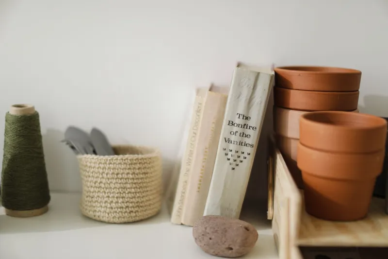
There's a meaningful difference between visible storage done well and just... having a lot of stuff out. The designers leading this trend are obsessive about systems. Color blocking. Material grouping. Consistent containers with enough variation to stay interesting. Depth and rhythm in how objects are layered on shelves.
A few principles keep showing up across different applications:
Density with breathing room. Fully packed shelves read as overwhelming. The most successful visible storage systems leave deliberate gaps — negative space that lets the eye rest and makes the overall arrangement feel considered rather than chaotic.
Consistency at the macro level. Even if the objects themselves are wildly varied, a unifying container system — same baskets, same bin style, same shelf depth — creates visual coherence without erasing the personality of what's inside.
Lighting as a design element. Shelf lighting has moved from a luxury upgrade to a genuine functional tool. When your storage is part of the room's visual identity, how it's lit matters as much as how it's organized.
Accessibility as a design value. Visible storage works best when it's also genuinely usable. If you have to move six things to get to the one you need, the system has failed — no matter how good it looks on camera.
The Screen Factor
It'd be naive not to acknowledge the role that video calls and content creation have played in all of this. When your background is part of your professional presentation — whether you're on a Zoom call with a client or posting a studio tour to your YouTube channel — the stuff behind you becomes part of your brand.
A lot of creative professionals have discovered that a well-organized, visually rich visible storage setup reads as more professional than a blank wall or a carefully staged minimalist corner. It communicates depth. It says: I do real work, I have real tools, and I'm not performing a version of myself that doesn't exist.
That's a genuinely interesting cultural shift — the idea that authenticity, even in professional contexts, might be more compelling than polish.
Owning It
The deeper current running through all of this is a kind of permission. Permission to have a life that leaves a visible record. Permission to design around who you actually are rather than who the design magazines told you to aspire to be.
Minimalism isn't going anywhere — it's a legitimate aesthetic with real value, and plenty of people genuinely thrive in spare, uncluttered environments. But for the rest of us? The ones with the overflowing bookshelves and the material samples and the tools we've collected over twenty years of doing work we care about?
Turns out there's a design language for that too. And it looks pretty great on screen.