Your Feed Is Lying to You: Why Designers Are Done Decorating for the Algorithm
Let's be honest about something: a lot of American homes look great online and feel kind of terrible to actually be in.
You know the aesthetic. Warm greige walls. A single artfully weathered linen throw draped across a sofa that appears to have never been sat on. A coffee table with exactly three objects on it — a stack of oversized design books, a small ceramic vessel, and something that might be a candle or might be a sculpture, it's genuinely hard to tell. The whole thing photographs beautifully. In person, it has the emotional warmth of a hotel lobby in a city you don't particularly want to be in.
This is what happens when interiors get optimized for screens instead of people. And it's a problem that the design world is increasingly willing to talk about out loud.
How We Got Here
The short version: Instagram happened. Then Pinterest happened. Then a generation of home renovation streaming content happened, and suddenly every American with a can of paint and a ring light became an interior design content creator. The feedback loop between what photographs well and what gets shared — and what gets shared and what influences purchasing decisions — compressed in a way that nobody fully anticipated.
The longer version is more interesting. Color psychology has been a legitimate field of study for decades. We've known for a long time that the colors surrounding us affect mood, cognitive function, stress levels, and even sleep quality. Warm reds and oranges tend to stimulate. Deep blues and greens have calming properties. High-contrast environments can feel energizing or exhausting depending on the person and the context. This is not fringe science — it's the kind of research that informs hospital design, school architecture, and workplace planning.
But here's the problem: most of that nuance evaporates the moment you're making design decisions based on how something looks on a 6-inch screen. Digital displays flatten color relationships. They compress tonal depth. They reward high contrast and punish subtlety. A rich, complex wall color that reads as warm and enveloping in a real room might look muddy or dull in a photo. A stark, minimal palette that feels cold and clinical in person can look impossibly chic in the right light, with the right filter applied.
Designers have been quietly aware of this gap for years. Now they're starting to talk about it at full volume.
The Streaming Effect
It's not just social media. The explosion of architecture and design content on streaming platforms — including, yes, the kind of content we cover here at ArchiWorld TV — has had its own influence on how Americans think about their living spaces.
Home renovation shows have always shaped taste. That's not new. But the sheer volume of design content now available, combined with the algorithmic pressure on creators to produce visually arresting thumbnails and shareable moments, has pushed the aesthetic needle toward the extreme. Dramatic before-and-afters. Maximalist color reveals. Spaces that are essentially stage sets, designed to read clearly and compellingly on a screen rather than to actually function as places where humans eat, sleep, and argue about whose turn it is to do the dishes.
The result is a kind of design inflation. Ordinary good taste doesn't get clicks. Extraordinary, slightly unhinged choices do. And when millions of viewers are exposed to that content week after week, it shapes expectations in ways that practicing designers are now having to actively work against.
"I spend a meaningful portion of client consultations explaining why their house shouldn't look like a TV set," one New York-based interior designer told a design publication recently. "They come in with screenshots from streaming shows and Instagram saves, and half my job is translating that into something that will actually make them happy to live in."
What Color Psychology Actually Says
Here's where things get genuinely interesting — and where the gap between screen aesthetics and real-life experience becomes most stark.
The muted, desaturated palettes that have dominated American interior design for the better part of a decade — the millennial grays, the greige waves, the "warm white" everything — photograph extremely well. They're low-contrast enough to feel cohesive in an image, and neutral enough not to clash with whatever furniture or accessories happen to be in the frame. For content creation purposes, they're nearly ideal.
For human beings who have to actually live in them? The research is less flattering. Extended exposure to low-saturation, low-contrast environments has been linked to decreased mood and a subtle but persistent sense of sensory deprivation. We are, evolutionarily speaking, not designed to spend our lives in spaces that look like a slightly overexposed photograph.
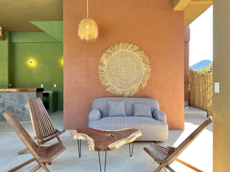
Color, used thoughtfully, does things to a room that no camera can fully capture. A deep, saturated green on a single wall changes the quality of afternoon light in a way that has to be experienced to be understood. A warm terracotta floor radiates a kind of ambient coziness that photographs as "orange" and reads as "cozy" in person. These are fundamentally different experiences, and optimizing for one actively undermines the other.
The Pushback Is Real
The good news is that there's a genuine counter-movement happening in the American design world, and it's gaining real traction.
Designers across the country are increasingly vocal about the importance of designing for the senses rather than the lens. That means richer color choices, more textural complexity, lighting schemes that prioritize human comfort over photographic clarity, and furniture arrangements that actually facilitate the way people move through and use a space — even when that's not the most Instagrammable configuration.
There's also a growing conversation about the role of digital design tools in this problem. Mood boards assembled from Pinterest saves and AI-generated renders don't just influence client expectations — they actively shape the design process itself, pushing decisions toward what looks good in two-dimensional, backlit digital form. Some designers are deliberately returning to physical samples, paint chips held up in actual rooms under actual light, as a corrective.
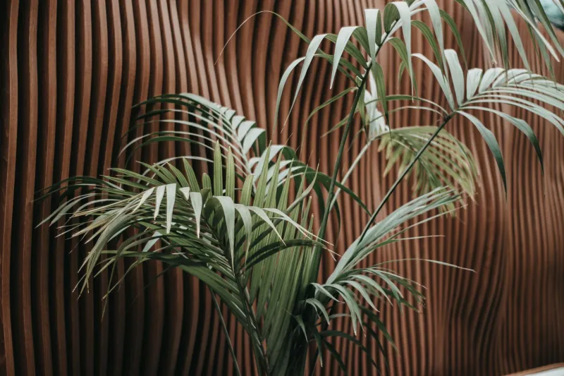
The biophilic design movement — which we've touched on before in ArchiWorld TV coverage — is partly a response to this same problem. Bringing natural materials, living plants, and organic forms into interior spaces is, among other things, a way of introducing sensory complexity that screens simply cannot replicate. Rough stone, weathered wood, the subtle movement of a living wall — these things register in ways that go far beyond what any camera captures.
Designing for the Person in the Room
At the end of the day, this is an argument for something pretty simple: design your home for yourself, not your followers.
That sounds obvious, but in a media environment that constantly rewards the shareable over the livable, it requires active resistance. It means being willing to choose the color that makes you feel good in the morning over the color that will make your living room look great in a wide-angle shot. It means accepting that the most meaningful design decisions — the ones that actually affect your daily quality of life — are often the ones nobody else will ever see.
The algorithm doesn't know how you feel when you walk into your own home. It can't measure the particular quality of late afternoon light in your bedroom, or the way a specific shade of blue makes your kitchen feel like a place you want to linger in over a second cup of coffee. Only you know that. And increasingly, the best designers in the country are asking you to trust it.