Gray Area: Inside the Design Movement That's Making Neutral the New Bold

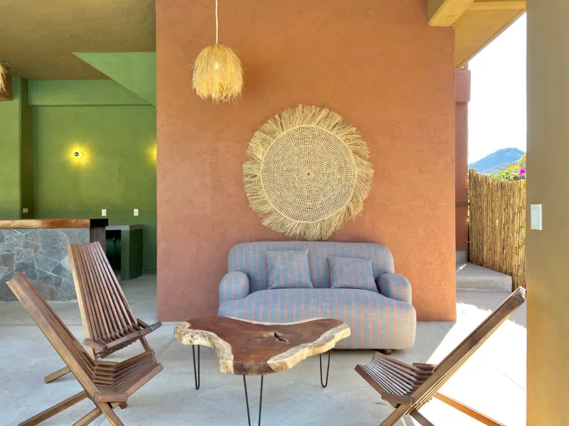
Scroll through Instagram or TikTok for about thirty seconds and you'll get the picture: color is everywhere. Cobalt blue kitchens. Mustard yellow lounges. Entire rooms drenched in terracotta like someone spilled a sunset on the floor plan. The dopamine-design era has been loud, relentless, and — if you ask a growing number of American designers — exhausting.
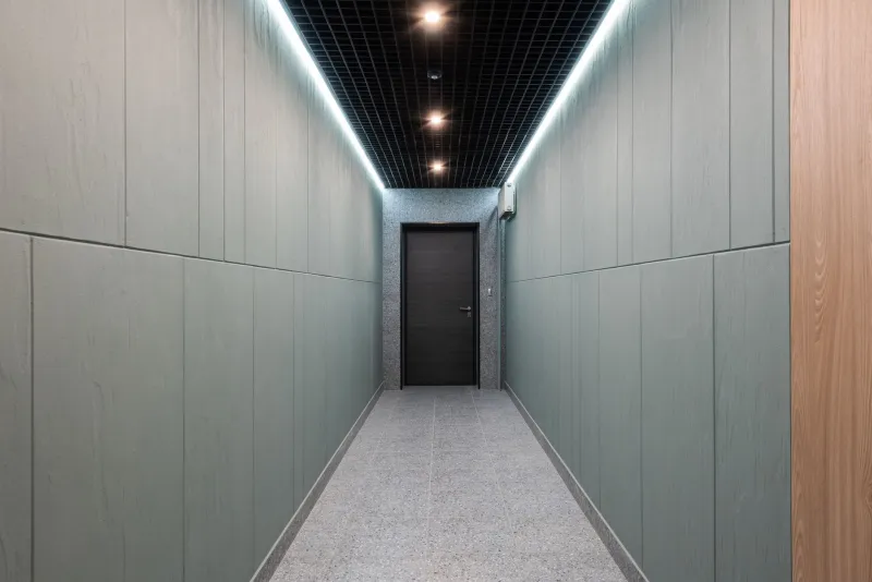
So it's no surprise that some of the most talked-about interiors right now look like they've had the color dial turned all the way down. Monochromatic. Muted. Gray on gray on gray. And somehow, against all odds, completely stunning.
This isn't minimalism in the Marie Kondo sense. It's something more deliberate, more loaded — a creative rebellion dressed in the quietest possible palette.
The Backlash Nobody Saw Coming
For years, the design world operated under an unspoken rule: restraint was safe, color was brave. Neutrals were what you chose when you couldn't commit. But that narrative is flipping fast.
"There's a fatigue happening," says Brooklyn-based interior designer Marcus Elroy, whose recent residential projects have leaned heavily into charcoal, slate, and warm dove tones. "Clients are coming to me burnt out. They've been watching their feeds fill up with every trend that lasted six weeks, and now they want something that feels genuinely theirs — something that doesn't look like it was designed for a thumbnail."
That phrase — designed for a thumbnail — keeps coming up in conversations with designers across the country. The implication is clear: a lot of what's been driving interior color choices lately hasn't been about how a space actually feels to live in. It's been about how it photographs. And people are starting to notice the difference.
What Grayscale Actually Does to a Room
Here's the thing about a well-executed monochromatic palette: it's harder than it looks. Anyone can paint a wall a single color and call it done. Pulling off a genuinely sophisticated grayscale interior requires a level of textural and tonal precision that most trend-chasing approaches skip entirely.
Chicago designer Priya Nambiar, who recently completed a gut renovation of a Gold Coast townhouse using almost exclusively a palette of warm whites, cool grays, and near-black accents, describes the process as almost sculptural. "When you remove color as a variable, everything else becomes amplified," she explains. "The grain in the oak flooring. The way light moves across a plaster wall at 4pm. The difference between a matte finish and a satin one. You start to see the room completely differently."
This is where the luxury argument comes in — and it's a compelling one. In a market flooded with fast-turnaround, algorithm-optimized design, the patience required to get a neutral palette right has become its own kind of status signal. It says: we took our time. We weren't chasing anything.
Mental Clarity as a Design Principle
There's also a growing body of thinking — backed by environmental psychology research — that suggests quieter color environments genuinely support cognitive function and emotional regulation. Not exactly groundbreaking news, but in the context of how frantic the broader visual culture has become, it lands differently.
"My clients are overwhelmed," says San Francisco-based designer Anya Kowalski, who describes her practice as rooted in 'chromatic deceleration' — a term she coined herself. "They're making hundreds of micro-decisions a day. The last thing they need is to come home to a space that's competing for their attention. Gray gives the brain somewhere to rest."
Kowalski's projects tend to combine layered grays with natural materials — unpolished concrete, raw linen, aged brass — to create environments that feel grounded without feeling sterile. The result is something that reads as genuinely calm rather than clinically cold, a distinction that matters enormously when you're asking someone to live in it.
Beyond Trend: The Timelessness Argument
One of the strongest cases for grayscale design is the one that has nothing to do with aesthetics at all. It's about longevity.
Designers who've watched clients repaint, refurnish, and redesign on two- or three-year cycles — chasing whatever color Pantone just declared significant — are increasingly steering conversations toward palettes that simply don't expire. A beautifully executed neutral interior from 1985 doesn't look dated the way a coral-and-teal kitchen from the same year does. That staying power is real, and clients are starting to factor it into their thinking.
"I've started framing it as a financial conversation as much as an aesthetic one," says Dallas-based designer Jerome Whitfield. "If your interior is trend-proof, you're not replacing it in five years. That's not boring — that's smart."
Whitfield's recent commercial projects, including a members-only creative workspace in Deep Ellum, have leaned into this philosophy hard. The space is almost entirely grayscale, punctuated by the patina of exposed structural steel and the warm tones of reclaimed wood. It photographs beautifully — which he admits is still a factor — but more importantly, it's designed to look exactly as good in a decade as it does today.
Is This Just Minimalism in a Trench Coat?
Fair question. The grayscale movement does share DNA with minimalism, but the designers practicing it are quick to draw a distinction. Minimalism, in its purest form, is about reduction — fewer objects, less stuff, negative space as the point. The grayscale approach is less about what you remove and more about what you choose.
You can have a maximalist amount of furniture, texture, pattern, and layering in a grayscale room. The constraint is chromatic, not compositional. Which is actually what makes it interesting — it's a creative challenge, not a retreat from creativity.
"People assume neutral means safe," says Elroy. "But try designing an entire room in forty shades of gray and tell me that's the easy path. It's not. It's just a different kind of bold."
What's Next for the No-Color Crowd
The grayscale movement isn't going to replace color. That would be both impossible and boring. But what it represents — a desire for intentionality, for staying power, for design that serves the people living in it rather than the people scrolling past it — feels like something that's here to stay regardless of what the next palette trend brings.
For creative professionals watching the design world from the outside, the message is worth absorbing: the most interesting spaces right now might be the quietest ones. The restraint is the statement. And in a culture that keeps turning the volume up, that's a genuinely radical move.